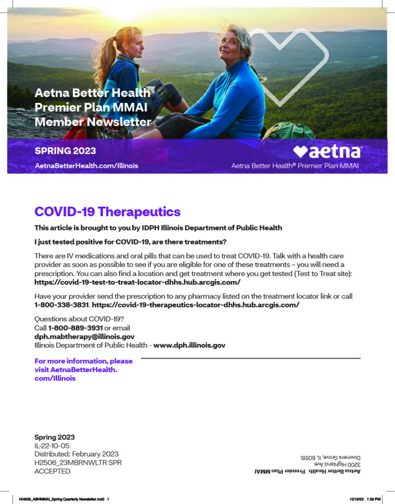
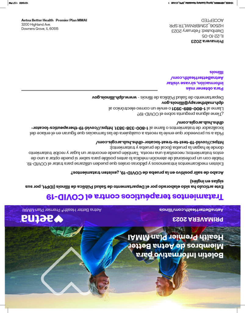
Aetna needed to distribute its quarterly member newsletter in both English and Spanish but wanted to avoid the added cost of printing and mailing two separate versions. This presented a challenge: how to deliver both language editions within a single printed piece, while preserving clarity, usability, and brand consistency for two distinct audiences.
To reduce costs without compromising the member experience, I developed a dual-format layout that housed both versions within a single booklet. The English edition occupied one half, while the Spanish version was printed upside down on the reverse—allowing readers to flip the newsletter over and read it from left to right as intended. Each side featured its own front cover, giving both language groups a polished and accessible entry point. This approach maintained visual integrity, respected language conventions, and helped Aetna meet its multilingual outreach goals within budget.