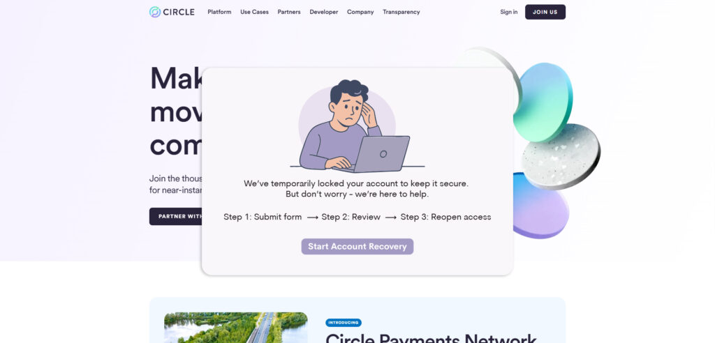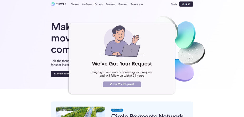
In fintech, trust is everything — and it’s often tested at the worst possible moments. When users are locked out of their accounts or waiting on support, even the strongest brands can feel distant or unhelpful. This concept series explores how thoughtful design can ease those high-stress moments. By combining soft visuals, clear language, and emotionally aware UX patterns, I reimagined Circle’s support experience as an opportunity to reinforce trust, not erode it.
The Perceived Problem
My Solution
Circle has received a number of negative reviews on platforms like Trustpilot, many centered around confusing account lockouts, slow support, and a lack of clear communication. While the technical product is strong, the experience during moments of frustration leaves users feeling abandoned and unsure.
Design can’t fix customer service delays — but it can change how those moments feel. With the right visuals, tone, and structure, even stressful interactions can become more human, more transparent, and more aligned with the trust Circle aims to build.
These screens are often the first point of contact for a frustrated user — and thoughtful design can help defuse tension, build clarity, and keep trust intact when it matters most.


