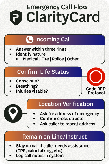
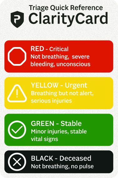
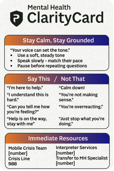
When I first learned about Prepared911’s AI-powered dispatch platform, I imagined a common challenge: even seasoned dispatchers might get momentarily tripped up by the basics of a new system while under pressure. In a high-stress environment like emergency communications, even small moments of hesitation can add friction — especially when users are still adapting to a new interface or tool.
To support that early learning curve, I created a set of desk-ready reference cards designed to anchor dispatchers during the onboarding process. Each card functions as a quick visual guide — combining infographics, keyboard shortcuts, and step-by-step workflows. They’re designed for clarity under pressure: minimal text, clear hierarchy, and fast scanning. This concept prioritizes usability in the moments that matter most, reinforcing trust in the system while users build confidence with the platform.